Here is How to Choose Poster Frames That Match Your Interior Style.
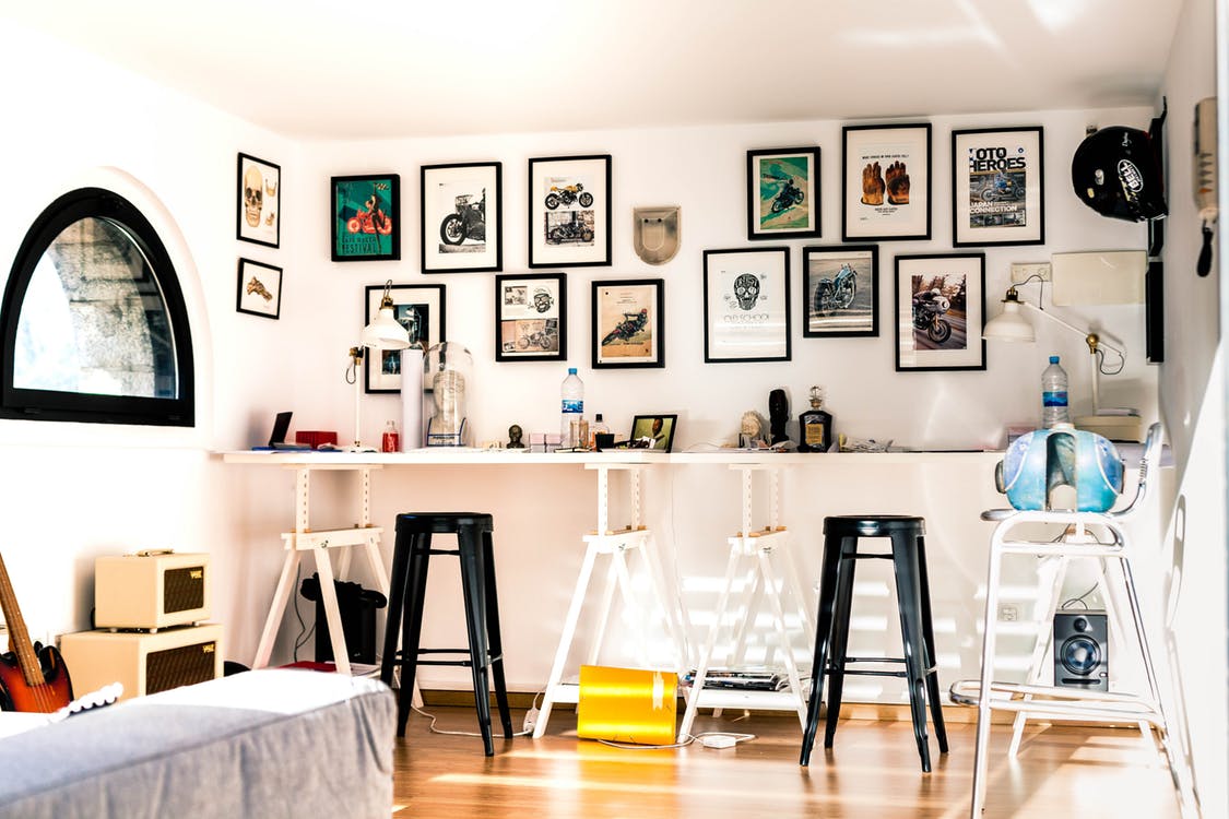
Picture this scenario: you've just bought the most stunning poster that speaks directly to your soul. You hang it up with careful attention, step back to admire your handiwork, and something feels completely off. The frame clashes horribly with your beautiful room's existing design elements, creating visual chaos instead of harmony. We've all experienced this disappointing moment, haven't we?
The truth is simple yet important. Poster frames aren't just protective borders for our precious artwork collections. They're silent decorators that can make or break the entire atmosphere of our living spaces. When we choose the right frame with thoughtful consideration, something magical happens in our rooms. Our posters don't just hang passively on walls like afterthoughts.
They become integral parts of the room's visual story and personality. They chat harmoniously with our furniture pieces, dance beautifully with our colour schemes, and create perfect harmony.
Before we dive headfirst into exciting frame shopping adventures, let's figure out what design style makes your heart sing. Trust us completely on this important step. This planning saves you from many embarrassing "what were we thinking?" moments later on.
Minimalist homes absolutely love keeping things simple, clean, and beautifully uncluttered throughout every single room. Think of those gorgeous Instagram-worthy spaces with barely anything visible on display surfaces.
Clean lines rule supreme in these peaceful environments. Neutral tones dominate every design decision with quiet confidence. If your home whispers gently rather than shouts loudly at visitors, you're probably a true minimalist at heart.
Bohemian design is the free-spirited interior design philosophy that exists without rules or limits on creativity and self-expression. It’s wonderfully eclectic, and vibrantly colourful, and absolutely loves to mash together textures from different cultures and different periods.
Globally minded boho houses are layered with patterns, colour and treasures that provide lovely glimpses into interesting stories. If your space has a warm artistic hug energy to it that invites everyone in, you’re definitely channelling some bohemian vibes.
Modern and Contemporary spaces focus entirely on sleek sophistication and cutting-edge design elements that feel current and fresh. These rooms strongly prefer materials that look advanced and futuristic. They often stick religiously to monochromatic schemes or create dramatic visual impact with bold, striking contrasts. Everything feels incredibly fresh and completely current with today's trends.
Traditional style never goes out of fashion, maintaining its elegant appeal across decades and generations of homeowners. These timeless homes warmly embrace:
Rich wood tones that tell beautiful stories of craftsmanship and heritage
Ornate designs that add distinctive character and sophisticated visual interest to rooms
Classic elements that successfully stand the test of time without looking outdated
Sophisticated details that whisper elegant refinement rather than shouting for attention
Industrial design boldly celebrates the raw beauty of unfinished materials and urban architectural elements throughout living spaces. Think of dramatic exposed brick walls, sturdy metal fixtures, and that edgy urban warehouse atmosphere. These confident spaces aren't afraid to show their bold, unconventional side to visitors.
Now comes the genuinely fun part of this creative process. We need to match materials thoughtfully and strategically. Think of this important step as introducing your chosen frame to your room's existing family. They absolutely need to get along harmoniously together.
Wood versus metal versus acrylic isn't really a fierce battle between competing materials, but rather finding the perfect personality fit. Wood frames bring natural warmth to absolutely any living space. They're like that wonderfully friendly neighbour who makes everyone feel genuinely welcome and comfortable. Metal frames offer sleek sophistication and impressive durability for long-term use. Acrylic frames are definitely the quiet introverts of the entire frame world. They let your precious artwork shine brilliantly without demanding unnecessary attention from viewers.
Here's something important we often completely forget during the selection process. Texture matters just as much as colour choice does. A perfectly smooth wooden frame feels completely different from a beautifully rustic, distressed one. Both frames might be brown in colour, but they tell completely different visual stories.
Consider what existing materials already live comfortably in your current space:
Wooden furniture naturally calls for complementary wooden frames, but don't be overly matchy-matchy
Metal light fixtures pair absolutely beautifully with carefully chosen metal frames
Glass coffee tables genuinely love transparent acrylic frames that don't compete visually
Mixed materials throughout your room give you much more creative freedom to experiment
The clever trick here is creating meaningful visual connections, not perfect carbon copies that lack personality. Your chosen frame should feel like it genuinely belongs in the space, not like it's trying desperately hard to fit in.
Colour choices can easily make us feel like we're standing confused in a massive paint shop. Let's simplify this potentially overwhelming process together with clear guidance.
Matching versus contrasting approaches both work absolutely brilliantly when executed with thoughtful consideration and careful planning. Matching creates peaceful harmony and calming visual flow throughout spaces. Contrasting adds exciting energy and captivating visual interest to otherwise plain walls. The key is knowing exactly what mood you want to create.
For existing wall and furniture tones, consider these helpful guidelines:
Light walls genuinely love both light and dark frame options equally well
Dark walls definitely prefer lighter frames to avoid mysterious disappearing acts
Neutral furniture pieces give you complete colour freedom to experiment boldly
Bold furniture might genuinely appreciate more subdued, quieter frame choices
In vibrant or eclectic spaces, a bold choice like a red poster frame can act as a striking focal point, especially against neutral walls. Don't be unnecessarily afraid of making a confident visual statement. Sometimes our boring walls genuinely need a little exciting visual stimulation.
Classic colours never let us down or disappoint us with poor results:
Black frames work everywhere without exception, seriously everywhere you can imagine
White frames feel fresh and clean in absolutely any room setting
Natural wood brings comforting warmth and organic beauty to sterile spaces
These are your completely safe bets when doubt starts creeping into decisions
Bold accent colours add distinctive personality and individual character to otherwise ordinary rooms:
Deep blues feel sophisticated and professionally designed without being stuffy
Rich greens bring natural outdoor elements indoors for organic visual appeal
Warm metallics add glamorous touches and luxurious visual interest to plain walls
Bright colours inject energising vitality and cheerful mood into dull spaces
Remember this important point: you're not committing to lifelong marriage here. Frames can be easily changed as your personal style evolves.
Size definitely matters, but not necessarily in the way you might initially think. It's entirely about proportion and visual balance throughout the space.
Room proportions should guide all frame choices with careful consideration of existing architectural elements and furniture placement. Large rooms can confidently handle bigger frames and bold, dramatic visual statements. Smaller spaces definitely prefer more delicate, subtle approaches that don't overwhelm. A tiny frame on a huge wall looks completely lost and sadly lonely. A massive frame in a small room feels overwhelming and uncomfortably bossy.
Wall size considerations require careful measurement and thoughtful planning:
Always measure your available wall space before beginning any shopping trips
Consider other decorative elements sharing the same wall space with your artwork
Leave adequate breathing room around your artwork for proper visual impact
Think carefully about furniture positioned below or beside your chosen frames
Gallery walls versus solo statements both have their appropriate place and specific purpose in interior design. Gallery walls work absolutely brilliantly for:
Collecting precious memories and favourite artistic pieces in one meaningful display
Adding captivating visual interest to long, boring hallways that need personality
Creating engaging conversation starters for guests who visit your home
Mixing different frame styles cohesively without creating visual chaos
Solo statement pieces excel particularly well when:
You want one special artwork to command complete attention from viewers
The available space calls for elegant simplicity rather than busy complexity
The artwork genuinely deserves to stand alone without competing visual elements
You strongly prefer uncluttered walls that breathe rather than busy ones
We're getting to the important nitty-gritty details now. These practical considerations save us from expensive, regrettable mistakes later.
Always measure absolutely everything twice with careful attention to accuracy and precision. Your precious posters, your available wall space, and even furniture spacing below. We honestly can't stress this crucial point enough for success. Many frame-buying regrets start with careless, inaccurate measurements that lead to disappointment.
Matting decisions matter much more than we typically think during the initial selection process. Mats create necessary breathing space around precious artwork pieces. They add sophisticated visual appeal and protect our valuable posters from damage. White mats work almost everywhere without exception. Coloured mats can complement or contrast beautifully when chosen with thoughtful consideration.
Consider these helpful matting guidelines for better results:
Small artworks often benefit significantly from generous, wide mats that enhance presentation
Large pieces might prefer thinner mats or no mats to avoid overwhelming
Dark artwork pops dramatically against light, contrasting mats for maximum visual impact
Light artwork can confidently handle darker mats without losing visual presence
Frame quality directly affects longevity and your long-term satisfaction with the purchase. Cheap frames might save money initially, but they often warp, fade, or break disappointingly. Quality frames protect our valuable investment in artwork and last for many years.
UV protection saves our precious artwork from gradual fading caused by harsh sunlight exposure over time. Australian sunlight can be particularly damaging to delicate artwork colours. UV-protective glass or acrylic keeps vibrant colours looking fresh much longer. Think of it as essential sunscreen for your valuable posters.
Choosing the right poster frames transforms our ordinary spaces from simple houses into personal homes that reflect our unique personalities. It's about balancing practical aesthetics with necessary function, creating visual harmony while boldly expressing individual personality. The perfect frame makes our precious artwork sing beautifully and our rooms come alive.
Don't feel unnecessary pressure to get everything absolutely right immediately. Start with one or two carefully chosen pieces and see how they feel. Live with them for a reasonable while. Notice how they interact with changing light throughout each day. Pay attention to how they make you feel emotionally. Remember, our homes should tell our personal stories, not follow rigid design rules.